A system-level redesign of a multi-category e-commerce platform spanning fragrance, beauty, body, and hair care. The project focused on restructuring the platform’s visual language, navigation systems, and shopping interactions to create a more seamless, intuitive, and scalable user experience.
Solution


⏳
2 months discovery & exploration
4 months design alignment
🖥️
Web
Defined discovery challenges and aligned platform goals with user behaviour.
Conducted exploratory research on browsing and decision patterns.
Defined information architecture and scalable navigation structure.
Designed end-to-end commerce journeys across key purchase stages.
Developed high-fidelity flows grounded in structural clarity.
As the platform expanded across fragrance, beauty, skincare, grooming, and lifestyle products, the shopping experience evolved without a unified structural approach. Product categories overlapped, navigation patterns became inconsistent, and browsing required increased effort. This made it harder for users to explore confidently and slowed their ability to evaluate and select products.
Before introducing systemic changes, it was essential to evaluate how the platform currently structured product exploration, how users navigated complex category relationships, and how established beauty commerce platforms approached scalability and experience consistency. This phase focused on identifying behavioural friction points, structural misalignments, and opportunities to build a more unified and future-ready commerce framework.
To inform the redesign direction, behavioural patterns in digital beauty commerce were examined to understand how users navigate complex product ecosystems, compare options, and build confidence in purchase decisions. Rather than focusing on static personas, the emphasis was on identifying real browsing behaviours, evaluation triggers, and friction points that shape decision-making across multi-category shopping journeys.
These insights guided the structural logic, interaction models, and experience priorities of the redesigned platform.


Key Behaviour Signals
To establish a grounded redesign direction, the existing platform experience was evaluated across structural, navigational, and interaction layers. The audit focused on understanding how the system supported multi-category browsing, product evaluation, and purchase decision-making at scale.
Rather than isolated usability issues, the assessment revealed systemic inconsistencies that impacted clarity, continuity, and confidence throughout the shopping journey.


To contextualise the redesign direction, established commerce platforms were examined to understand how large-scale product ecosystems balance scalability, clarity, and experiential richness. These observations informed structural and interaction-level decisions shaping the redesigned platform experience.
The embedded review illustrates how structural decisions at the category level influence clarity, exploration flow, and product comprehension.


Insights from behavioural patterns, platform assessment, and ecosystem analysis were synthesised to identify systemic factors shaping how users navigate, evaluate, and build confidence in complex commerce environments. This synthesis revealed recurring challenges in structural predictability, decision support, and information clarity, guiding the strategic direction of the redesigned platform experience.
This phase centred on translating key insights into systemic design principles. This involved redefining how products were grouped, how browsing pathways were structured, and how decision-support mechanisms were embedded throughout the experience to enable both immediate usability improvements and long-term platform scalability.
Methods such as category grouping exercises and card sorting were used to understand natural product associations and validate clearer navigation patterns. These insights informed the development of a unified information architecture that supports intuitive exploration, easier comparison, and more confident decision-making across multiple categories. This structured framework then guided subsequent interaction and interface design decisions, ensuring that visual improvements were grounded in a coherent and scalable system.
Card Sorting


This exercise revealed natural grouping patterns that guided the restructuring of the platform’s category and navigation framework.

Information Architecture
The platform’s information architecture was restructured to create a clearer and more scalable multi-category commerce system. The updated structure simplified category depth, reduced redundancy, and established stronger relationships between product groups across fragrance, beauty, grooming, and accessories. It also aligned navigation with real shopping behaviours by introducing alternative exploration pathways such as fragrance families and concern-based browsing. This approach enables more intuitive product discovery while supporting future catalogue expansion without increasing complexity.
Key Architectural Principles

Building on the defined structural framework, the redesign consolidated key architectural and interaction decisions into a unified commerce experience direction.
By establishing a structured discovery framework and refining key interaction flows, the platform supports intuitive browsing, meaningful product evaluation, and seamless purchase progression across diverse categories.
The proposed information architecture was translated into key commerce flows to evaluate how structural decisions support real browsing, evaluation, and purchase behaviours. These wireframes focus on validating navigation clarity, content hierarchy, and interaction continuity across critical stages of the shopping journey before progressing into visual design.
The homepage explores how users are introduced to the platform’s category ecosystem through promotional content, sub-category entry points, and recommendation modules. The layout prioritises multiple discovery pathways while maintaining clear hierarchy between campaign-driven exploration and intent-driven browsing.

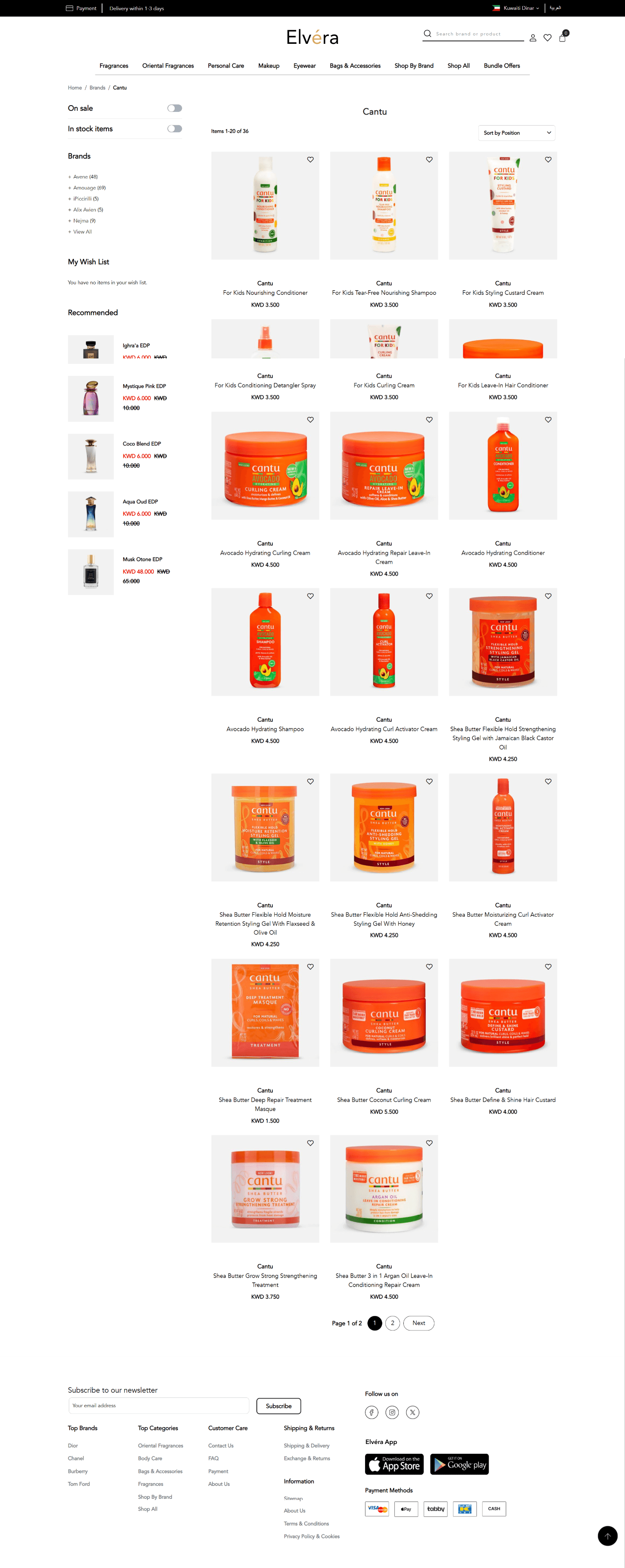
The listing experience focuses on structured product comparison through filtering, sorting, and contextual grouping. The goal was to reduce cognitive load by enabling users to refine results progressively while maintaining visibility of category context and browsing controls.

Product detail wireframes prioritise decision support through clear information hierarchy, trust signals, and contextual recommendations. The layout ensures users can evaluate product attributes, pricing, variants, and reviews without losing purchase momentum.

The cart experience focuses on transparency and momentum preservation by clearly presenting product summaries, pricing breakdowns, promotional inputs, and checkout progression indicators. Mini-cart interactions were designed to provide quick awareness without interrupting ongoing exploration.

The checkout journey was structured as a sequential, context-aware flow covering delivery details, address validation, payment selection, and order confirmation. The design accounts for region-specific behaviours such as PACI-based auto-population, payment method availability constraints, and gift purchase scenarios, ensuring task clarity during high-intent conversion stages.


Due to the scale and complexity of the redesigned commerce experience, only key representative flows are highlighted within this case study. The full set of wireframes, covering additional scenarios, edge states, and system interactions, can be explored through the embedded prototype.

Each decision focused on removing friction at critical moments, from understanding product options to progressing through checkout. Rather than introducing new features, the emphasis was on simplifying interactions, clarifying information, and ensuring that users could move through the shopping journey without unnecessary interruptions.
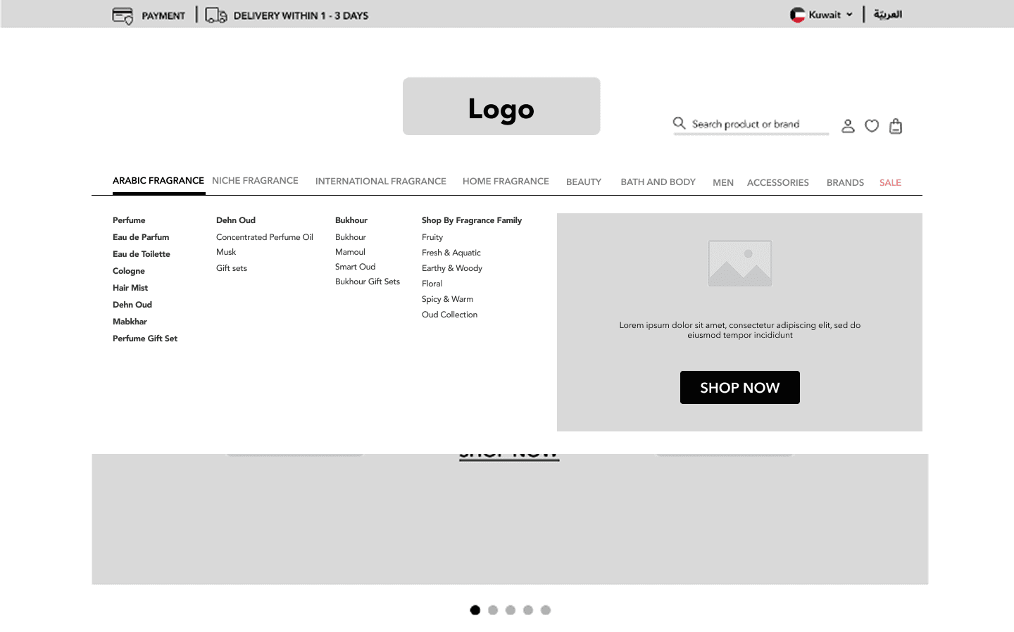
Through iterative refinement of browsing, product evaluation, and checkout experiences, the platform’s structural direction was translated into a cohesive and usable shopping system.
The interface design brings together the structural and interaction improvements introduced earlier, shaping a cohesive visual experience across the platform’s core shopping flows. The focus was on making complex product journeys feel simpler through clear hierarchy, consistent components, and restrained visual expression that supports rather than distracts from decision-making.




The redesign emphasised the role of system-level thinking in improving commerce usability and conversion continuity. Establishing a scalable information architecture and interaction framework helped address friction across browsing and purchase flows, reinforcing the need to prioritise structural clarity before visual refinement. The project also underscored the importance of designing experiences that can evolve alongside expanding product ecosystems and changing user behaviours.
Future improvements would focus on translating the redesigned experience into mobile-first interaction models, validating key decisions through real usage data, and enhancing contextual personalisation to support more relevant product discovery. Strengthening checkout resilience and cross-device continuity would further ensure that high-intent users can complete purchases without disruption as the platform scales.