Singularity Creditworld is a forward-thinking financial platform designed for a digital-first economy, where technology and intelligence reshape how credit systems operate.
Built around the idea of evolving beyond traditional financial limitations, the brand reflects a shift toward faster, smarter, and more adaptive credit ecosystems.
It represents a new approach to lending, where access is seamless, decisions are intelligent, and systems are designed to scale with the needs of modern users.


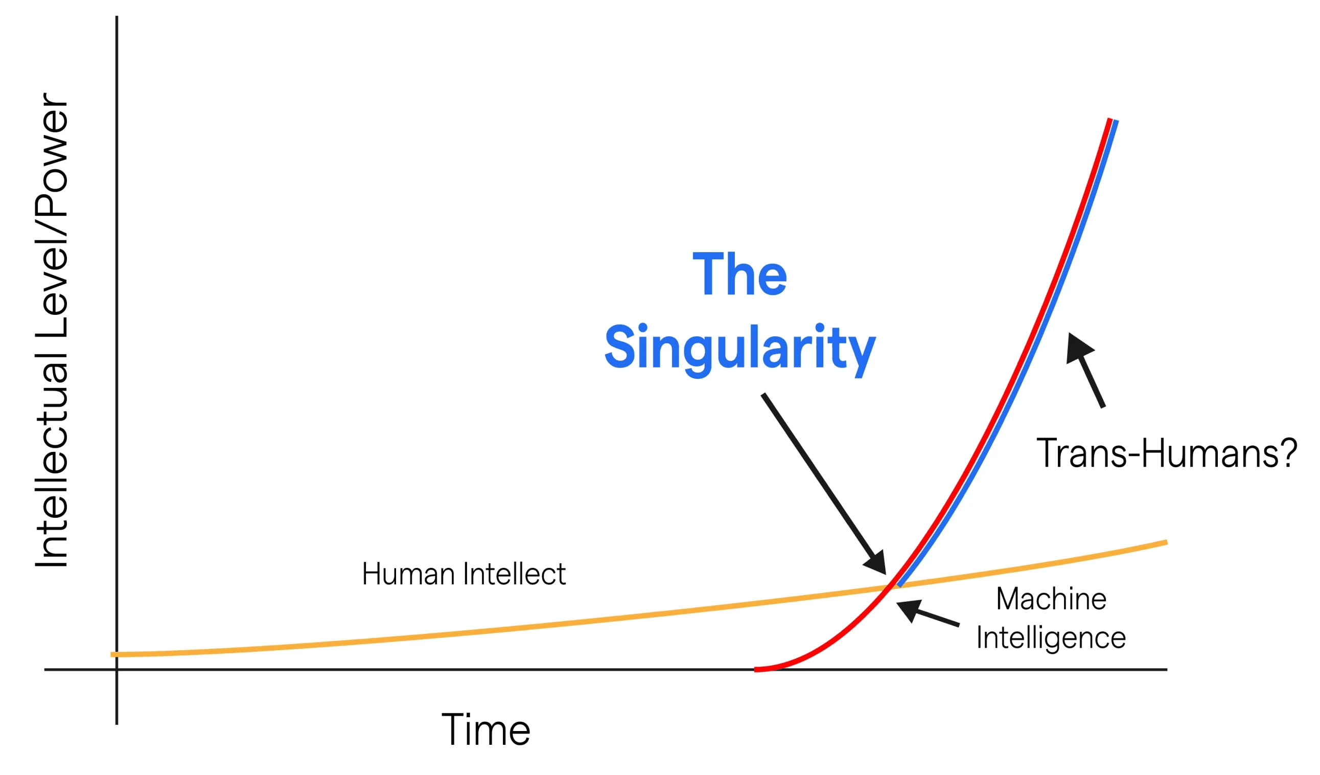
Traditional systems grow in a linear, predictable way.
With the introduction of technology and smart systems, this growth begins to accelerate, shifting into exponential behavior.
This transformation can be understood through the concept of technological singularity.
Technological Singularity

Visual exploration
The identity evolved through a series of explorations, translating a conceptual system into a refined visual form.
01
Starting from the singularity graph, the focus was on isolating the moment where linear growth shifts into acceleration.

02
Multiple curve variations were explored to understand how acceleration could be expressed visually.
Subtle changes in curvature, angle, and intersection were tested to find the right balance between control and momentum.
These iterations helped define a form that feels directional, dynamic, and grounded, capturing both stability and movement within a single gesture.





03
The abstract structure was then translated into a compositional system using contrasting forms.
Color was introduced to differentiate states, where blue represents stability and foundation, while red conveys energy and acceleration.
Through this contrast, the relationship between control and transformation becomes visually clear and cohesive.


04
The form was gradually simplified to its essential elements, removing unnecessary complexity while preserving the core transition.
Edges were refined, proportions adjusted, and the interaction between shapes carefully balanced to achieve clarity and precision.
This stage focused on restraint, ensuring the mark remains minimal while retaining its conceptual depth.



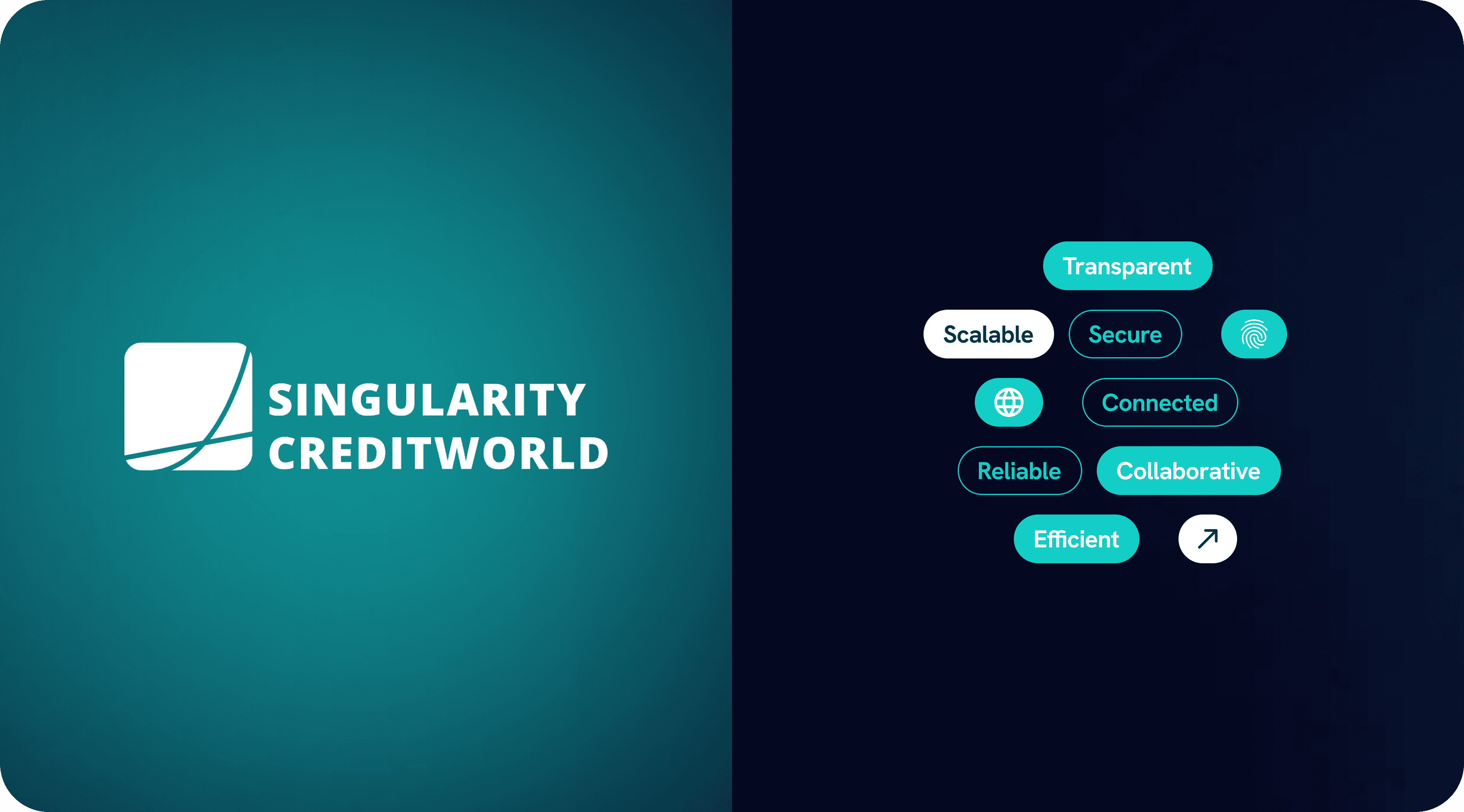
The final mark captures a compressed moment of transition where linear growth breaks into acceleration.
It brings together structure, tension, and motion into a unified form that feels both stable and forward-moving.
The result is a minimal yet expressive identity that reflects the evolution of systems into intelligent, adaptive growth.




Working on Singularity Creditworld shifted my approach from designing visual outputs to understanding underlying systems. The challenge was not to represent the idea of singularity literally, but to translate its behavior - transition, tension, and acceleration, into a minimal and cohesive form.
One of the key learnings was the importance of reduction. Moving from a complex conceptual graph to a simple visual mark required removing everything that wasn’t essential, while still preserving meaning. This process helped me focus on clarity, balance, and intentionality in every decision.
This project also reinforced the idea that strong identities are not built from decoration, but from structure. By grounding the design in a clear concept, the final outcome feels both expressive and controlled, capable of communicating complexity through simplicity.
